Interface overview
The App Builder interface is similar to the interface of most design tools you may already be used to, with some minor differences. But in all cases you are going to get used to it very quickly. There are four main sections in the App Builder.
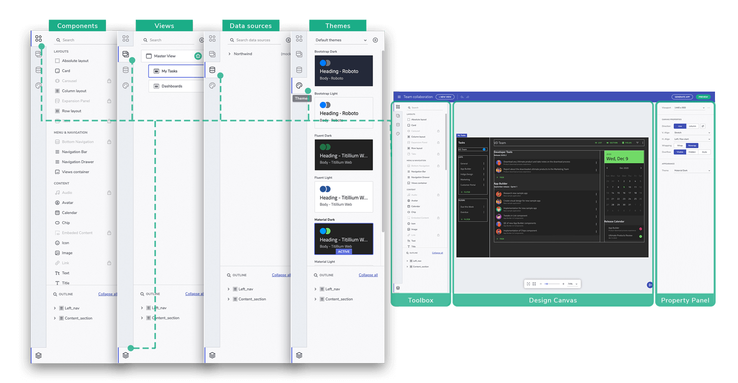
Interface screen parts
Toolbox
The Toolbox is the section on the left-hand side and it includes five tabs for Components, Views, Data Sources, Themes and the Outline Tree.
The Components tab gives you access to all available components in App Builder that you can add to your design canvas and configure for use. The search input on the top of the components list makes easy to find a particular component. Below the Components tab you will find the Views tab. In the views tab you can find all the views in the application displayed with their parent-child relationships. The third tab is Data. This is where all data sources and related options are located. You can view and edit all available data sources, as well as add a new one. The fourth tab gives you access to all theming capabilities and to all available preconfigured themes. You can create and edit your own themes and quickly switch between them. The last tab - the Outline Tree - shows you a detailed hierarchy of the components in the selected app view.
Design Canvas
In the middle of the screen is the Design Canvas where the applications are being designed. Simply, drag & drop or double click on the component you want to add from the Toolbox and it will appear on the Design Canvas as a part of the application view that is being designed. At the bottom, you can see the zoom bar with some helpful options like predefined zoom values, set to actual size or zoom to fit. To the right of the zoom bar is the Send Feedback button which lets you send us feedback or feature requests directly from the App Builder, without interrupting your app design process.
Property Panel
On the right side of the screen is the Property Panel with viewport, Design Canvas and components related options. Once a component is selected, the properties in the Property Panel can be used to edit component’s size, position, layout, spacing, and/or to add data repeaters and interactions. The Property Panel offers you properties specific to each component type.
Additional Resources
 GitHub