Responsive fluid layouts
Fluid layouts are always a challenge to create. In this mini tutorial you will see how to quickly create a 3-column layout and then make it behave responsive when the screen size changes.
This tutorial will show you how to use the Layout properties in App Builder to achieve this dynamic stacking effect.
Step 1: Create the base layout
- Create a New app using a Blank template.
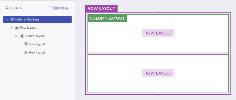
- From the Components Toolbox, add a Row layout to the canvas and enable
Resize: Grow. - Set Appearance for the Row layout:
Padding: 24pxGap: 24pxBg.Fill: Gray-200
- Inside the Row layout, add a column layout, enable
Resize: Grow, and setGap: 24px. - Inside the column, add two row layouts, and set both to
Resize:GrowandBg. Fill: White.
Pro-Tip: Remember that you can always add a new component to the canvas by using
Ctrl + E/Cmd + E, which will speed up your app creation process!
Step 2: Create the 3-column structure
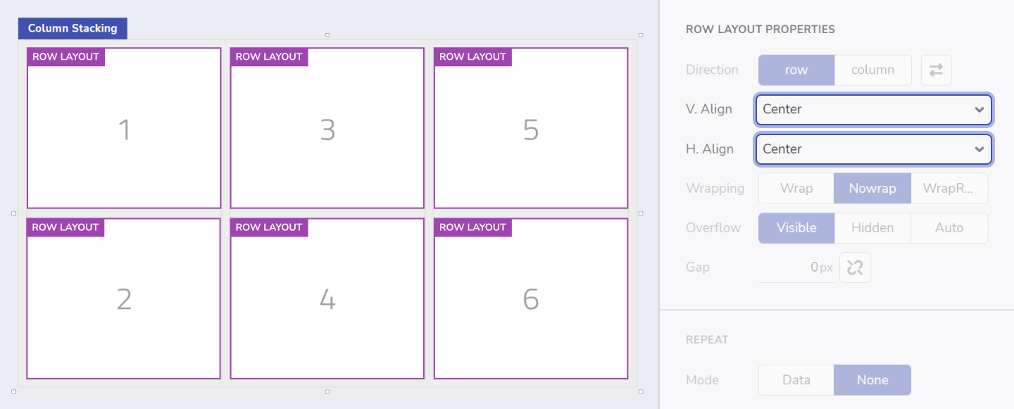
- Copy the column layout containing the child rows, and paste twice to create a 3-column layout.
- To help identify each row layout easily:
- Add inside each one a Title component and give them a number, in the same order as the picture shown below.
- Select all 6 row layouts with multiple-selection (shift + click) and change the alignment by setting
V.Align: centerandH.Align: center.
Step 3: Preparing for stacking
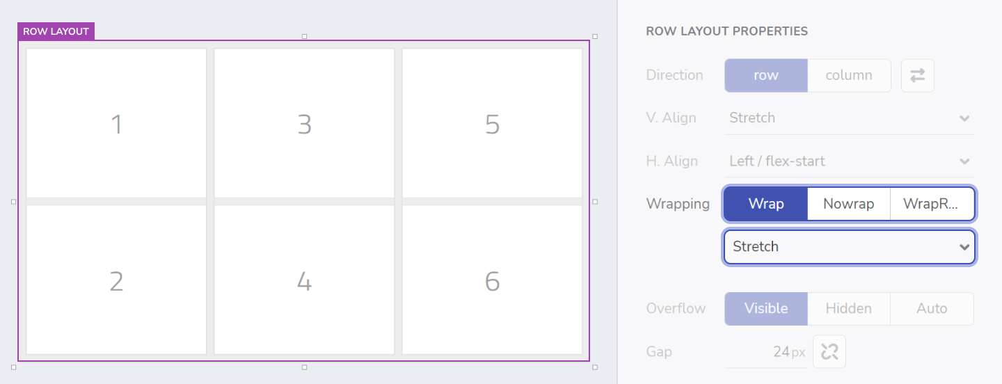
- Select the parent row layout that contains those 3 column layouts and set
Wrapping: wrap. - In the dropdown below, change the content alignment to
stretch.
Step 4: Make it stack!
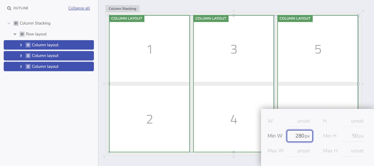
In order for the stacking to happen, the three Column layouts inside that Row layout need to have minimum widths set. When previewing the app, as the Browser width is reduced, each column will shrink till they reach that min-width. When this happens, the child layouts will stack as a result of setting Wrapping: wrap.
- To achieve this, select the three columns and set
Min. W: 280pxfor each. - Preview your application to see how the columns stack vertically when you resize the browser.
- You can also use the Breakpoint selector to switch to smaller devices.
- Click on Edit to continue editing your app.
Step 5: Let’s take this one step further!
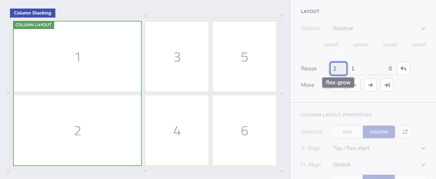
Finally, I would also like the first column to be wider than the other two. So what I need to do is change its Resize settings.
- Select the first column and on the layout properties, click on the
editbutton next toGrowandShrink, and set theflex-grow:2.
This will make the first column to take twice as much available space (horizontally) than the other 2.
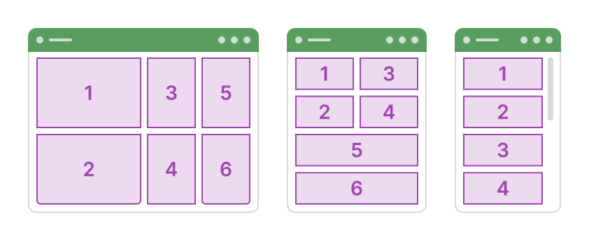
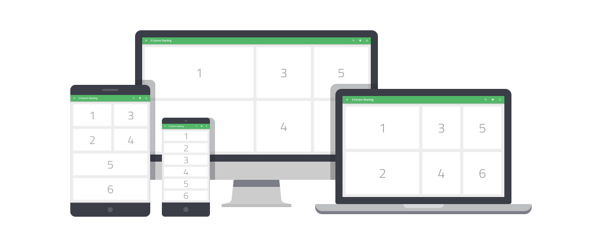
And we're done!
Here's the end result of our application in 3 different screen sizes. You can also check out the live app here
- App Builder Components
- Flexbox
- [A Guide to flexbox](<https://css-tricks.com/snippets/css/a-guide-to-flexbox/)
- Flexbox Froggy
- Indigo.Design Getting Started
- Indigo.Design Styling Overview
 GitHub