
App Builder Release with Pivot Grid, Tree Grid Hierarchical Data Support, and More
The December release of App Builder is here and it brings exciting improvements - Pivot Grid, Tree Grid, and others.
December’s update of App BuilderTM is here and it includes significant updates. If this is your first time learning about App Builder, let me quickly share why you should consider it as a key tool in the application development process for your organization:
- A visual app builder – the unified platform for product managers, designers, and developers.
- Cloud-based WYSIWYG drag & drop tool that helps companies design and build complete business apps 80% faster than ever before.
- A low-code tool producing brilliant Angular, Blazor, or Web Components code (React soon) from your Sketch or Figma design files.
All That’s New and Exciting in Infragistics’ Low-Code App Builder
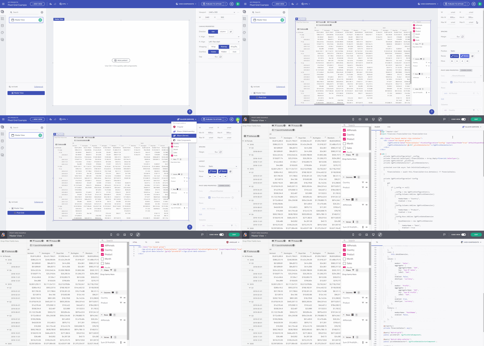
Pivot Grid
The App Builder Grid’s family is growing with yet another one – Pivot Grid. Even though the Grid is added just as a placeholder element, upon export you can configure it for summing up and representing large multidimensional data in a cross-tabular format. The data summary can be easily and quickly sorted, grouped, or filtered. Such data can include sums, averages, and other statistics.
Hierarchical data support for Tree Grid component
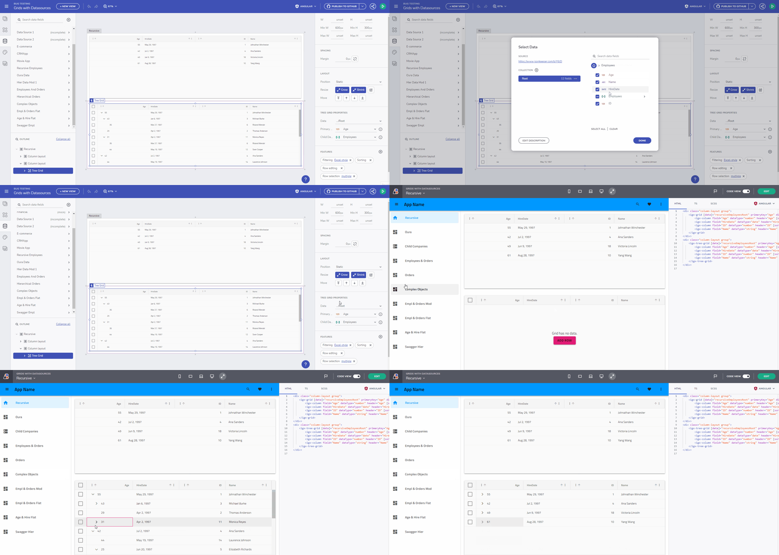
The previous version of TreeGrid was allowed to only use collections at the root level. Now you can:
- Bind to Hierarchical Data Structure – The data field property is supporting arrays itself.
See Hierarchical Data Support for Tree Grid example below.
[
    {
        "EmployeeID": 9,
        "LastName": "Dodsworth",
        "FirstName": "Anne",
        "Orders": [
            {
                "OrderID": 11058,
                "ShipAddress": "Forsterstr. 57",
                "ShipCity": "Mannheim"
            }
        ],
....
    }
]
- Bind to a self-referencing Hierarchical data source – The object structure (the data fields) of the records in the nested Array are the same as those in the root Array.
See the code snippet below. Keep in mind that based on the provided data source, the Tree Grid will automatically choose how to bind. From binding with primaryKey and foreignKey to binding with ChildDataKey and vice versa.
[
    {
      "ID": 1,
      "Age": 55,
      "Name": "Johnathan Winchester",
      "Employees": [
        {
          "ID": 2,
          "Age": 43,
          "Name": "Michael Burke"
        }
      ]
    }
]
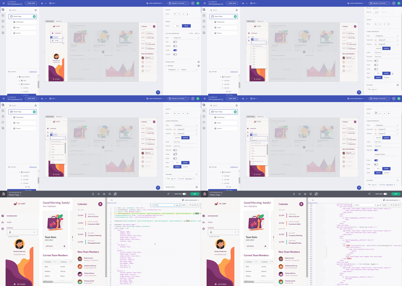
Combo Component: Code Generation
You can now generate Combo components for both Angular and Web Components. The Combo component represents a drop-down list that provides editable functionalities, allowing users to choose an option from a predefined list.
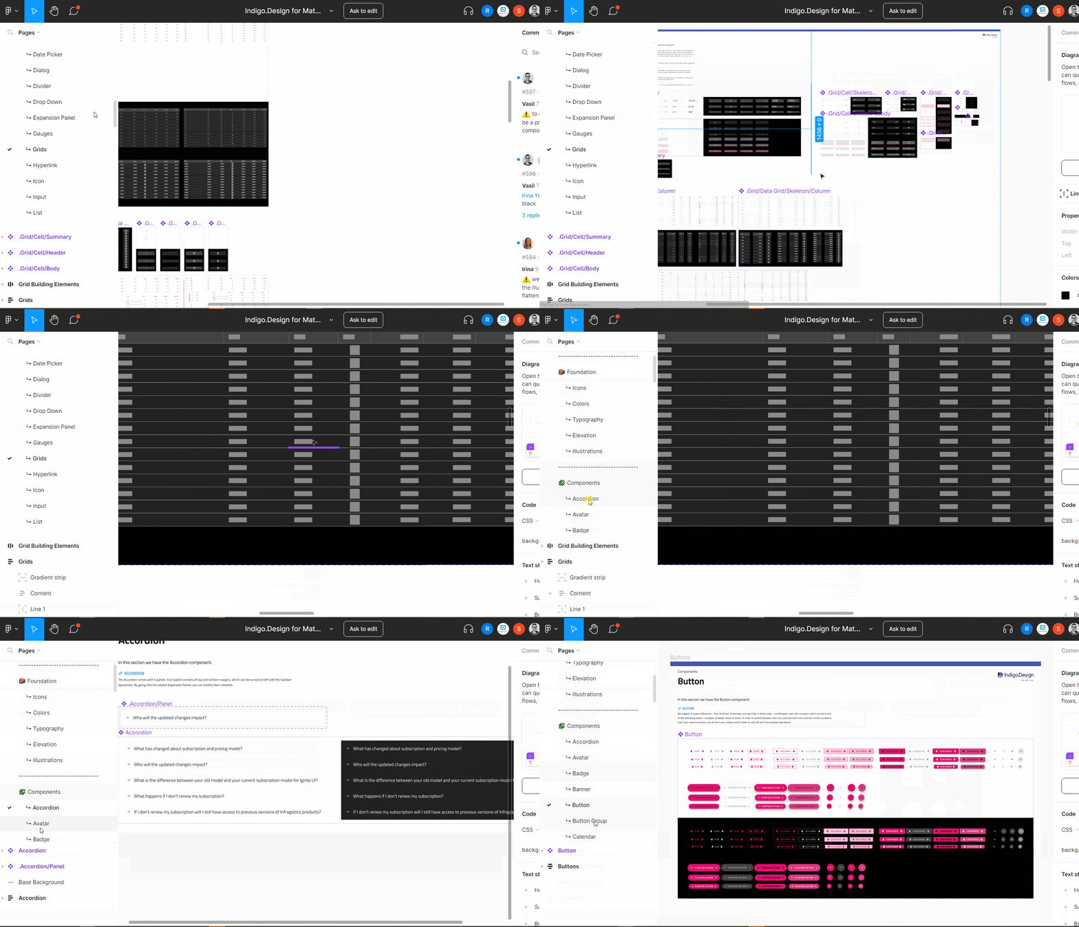
Figma Indigo.Design UI Kit and Plugin
Our Design-to-code story is getting bigger and better! The brand-new Figma Indigo.Design UI Kit for Material maps to our Ignite UI for Angular, Blazor and Web Components UI toolset to completely redefine design-development processes. You now get a robust set of components, patterns, styling, and customization options, empowering you to import prototypes or any type of screen designed in Figma and transform it to clean code.
You can now download the Figma UI Kit, Plugin or Sample Apps.
Remember Authorization Details When Connecting To REST API Endpoints
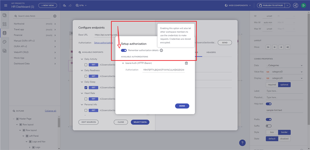
Now you can set your credential to be securely stored. In the Auth dialog when configuring REST endpoints, we will ask whether to “Remember authorization details”. This also applies for when you are adding a URL and provide a header auth.
- If you haven’t ‘checked’ the switch, when you open the app for a second time, we won’t have access to reach out to the public url/file so we will give you mock data based on the data schema stored when the data source was configured for a first time.
- If you do agree to “remember auth details” we will store them encrypted on our servers.
Mock Data Specifics
We are storing the mock data on the browsers local storage. When mock data is generated for a first time, we will store it in the localhost session. LocalStorage has no expiration time. So in order to clear it, manual steps should be taken.
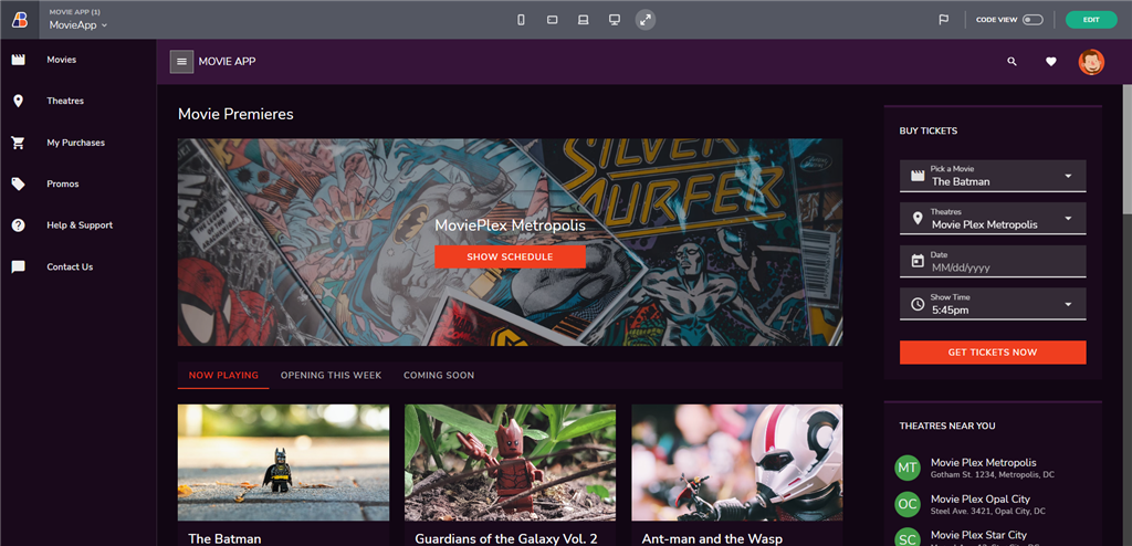
Movie Sample Application
A new sample application has been added that exposes a UI for functionality for Movie booking and premieres. The application is also showing the usage of components like Navigation Drawer, DropDown, Tab, Select, Date Picker, List, Buttons, Avatars and a lot of beautiful layouts.
Interesting Articles
Check out the list of articles that we’ve been working lately:
- Reduce Complexity of Mission Critical Enterprise Software with Low-code tools
- What is Rapid Application Development
- Design-to-code Solutions Explained
- UI Component Libraries – Build vs Buy
Wrap Up
Briefly described, these are all the new features and components that you will see in the June update of App Builder. If you need more details, we encourage you to check out our:
Of course, if you feel we have missed anything or you have a question, just drop us a line on zkolev@appbuilder.dev.
Lastly, if you want to see all the exciting new tweaks and upgrades in App Builder with the latest Infragistics Ultimate 22.2 product launch, watch the quick overview below.

