App Builder Release with Charts Support and More
What to expect from App Builder in the release this month? Brand new Category chart, Pie chart and more.
June’s update of App BuilderTM is here and it includes significant updates. If this is your first time learning about App Builder, let me quickly share why you should consider it as a key tool in the application development process for your organization:
- A visual app builder – the unified platform for product managers, designers, and developers.
- Cloud-based WYSIWYG drag & drop tool that helps companies design and build complete business apps 80% faster than ever before.
- A low-code tool producing brilliant Angular, Blazor, or Web Components code (React soon) from your Sketch or Figma design files.
All That’s New and Exciting in the Low-Code App Builder
Category Chart
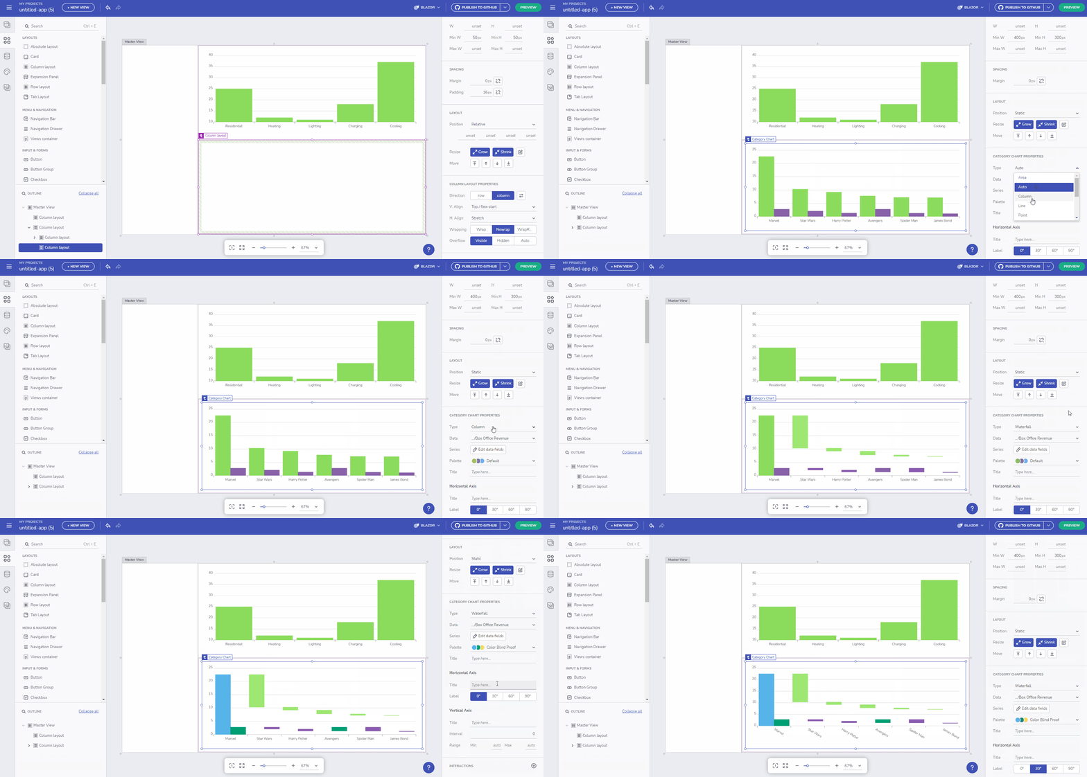
The Category Chart (also known as Column Chart or Vertical Bar Chart) was among the most wanted components as part of the App Builder. This is a Chart used to quickly compare frequency, count, total, or average of data in different categories with data encoded by columns with equal widths but different heights. This chart emphasizes the amount of change over a period of time or compares multiple items.

The available Chart types are Auto, Column, Line, Spline, Area, Spline area, Step line and Step area. The Data dropdown specifies chart’s data source. You can use the Series picker dialog in order to change which category and value fields to be shown. If you want to use a different palette (custom as well), you can use the Palette picker. Title property is available for the Horizontal Axis, Vertical Axis and the Chart itself, as well as the ability to change the H.Axis Label angle and V. Axis Interval and Range.
Pie Chart
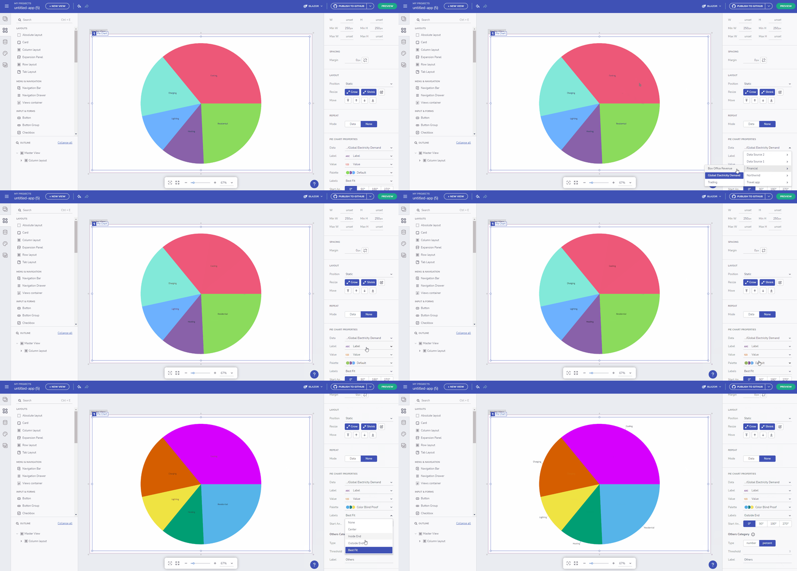
The Pie Chart, yet another great component now available in the toolbox, is a part-to-whole chart that shows how categories (parts) of a data set add up to a total (whole) value. Categories are rendered as sections in a circular, or pie-shaped graph. Each section, or pie slice, has an arc length proportional to its underlying data value. Categories are shown in proportion to other categories based on their value percentage to the total value being analyzed, as parts of 100 or 100%.

More details on the functionalities. Pick a different data source through the Data dropdown and change the Label value if you want to show different fields. In order to see a different Palette you can use the Palette picker. Labels position can be changed to best fit the chart, be on the outside end or any other available option. You can easily alter the “Others” category as well, change its type from Number to Percent or update the Label text. “Others” is combining the categories with value less than threshold as a single “Others” category. Type “0” to disable this.
Local Network Data Access
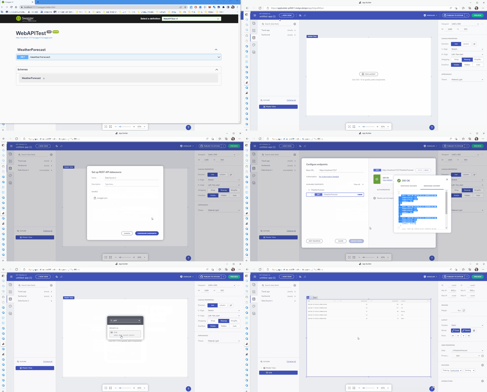
Previous versions of App Builder only supported cloud-based data access via JSON, REST or Swagger endpoints. With this update, you can now add data sources that point to localhost and on-prem data source, just like you would a cloud data source! To make this work, your data source must support CORS (Cross-Origin Requests). If you are building a .NET Web API, this is possible by enabling CORS in your program.cs file like this:
if (app.Environment.IsDevelopment())
{
    app.UseCors(x => x.AllowAnyOrigin());
}
For additional security, setup and configuration details, check out the docs, and if you run into any issues, please comment to the GitHub issue.

Update GitHub Without Rolling Back User Changes
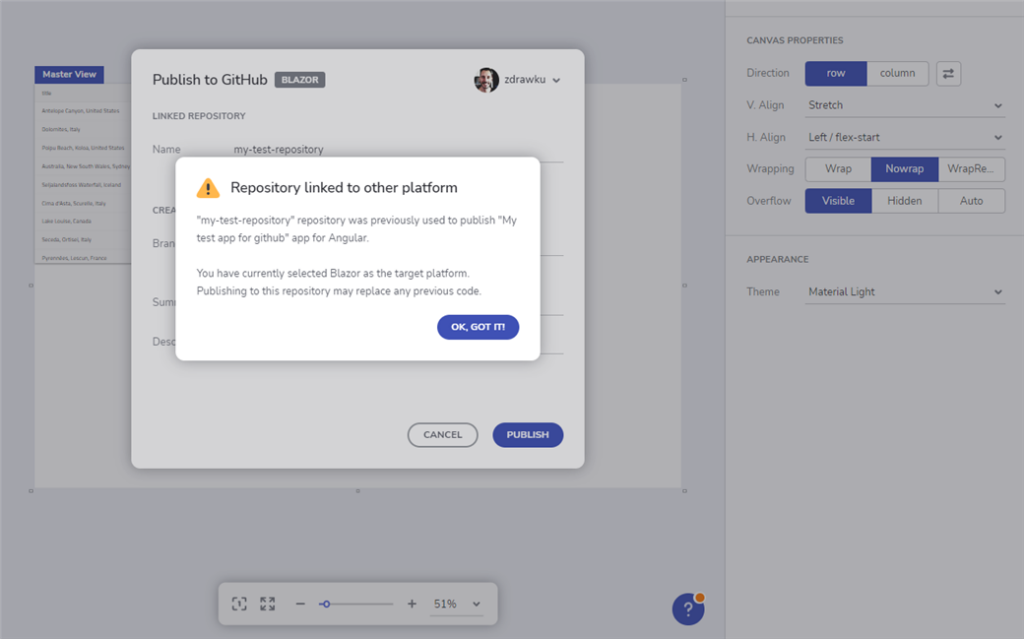
As you know with the GitHub integration, App Builder users have the option to publish their application generated code to GitHub. We’ve added a new integration point that now respects the user modifications in main/master branch outside App Builder. You may notice the following changes:
- Warnings when external changes are made in a pull request’s associated branch.
- Warnings and guidance when conflicts are found.
- Warnings when a repository corresponding to other application or platform is chosen.
- Ability to go back and forth between different repositories used in the history of an application.

Please note these changes are one-way interaction with GitHub (i.e. Github changes cannot go back to AppBuilder).
CSS Shadow Parts Support
During code generation for Blazor, styles will now target specific parts outlined by the component. Тhese parts will also be taken into account when grouping styles into CSS classes.
CSS Shadow Parts allow styling an element inside of a shadow tree. Ignite UI Blazor components are also using outlined parts for styling and this is now available in the generated code for any Blazor application. Тhese parts will also be taken into account when grouping styles into CSS classes.
.button_ {
  margin: 0 16px
 }
.button_1::part(ba
 color: hsla(var(--igc-surface-500));
}
Wrap Up
Briefly described, these are all the new features and components that you will see in the June update of App Builder. If you need more details, we encourage you to check out our:


